I’ve been asked by a few friends about my view “Apple’s design elements which resemble real-life,” and if I think it is the future. On the other hand, Microsoft’s minimalist Metro UI, too, got its praises.
Defining Skeuomorphism
The word simply describes the way designs often imitate a feature from the real-world, particularly from the past. For example, the shutter noises in smartphones when clicking a picture and a real book experience when reading an e-book. The way Wikipedia describes it is:
A skeuomorph is a physical ornament or design on an object made to resemble another material or technique. While Wikipedia mentions only a “physical ornament”, we’ve seen many skeuomorphs like the lifelike textures and controls inspired from the Mac, which is purely digital.
On the other hand, the newly popular “flat style” of design has its own benefits. Examples include Microsoft’s Metro UI (I know it’s now called Modern, but I don’t care), which plain simply resemble flat shapes and colors, indicating minimalism.
It all started with the Mac.
Bill Atkinson, an Apple engineer at that time, rushed into Apple to show his progress off to anyone who would appreciate it. This time, he visited the Macintosh offices at Texaco Towers to show off his brand new oval routines, which were implemented using a really clever algorithm. Bill fired up his demo and it quickly filled the Lisa screen with randomly-sized ovals, faster than you thought was possible. But something was bothering Steve Jobs. “Well, circles and ovals are good, but how about drawing rectangles with rounded corners? Can we do that now, too?” ”No, there’s no way to do that. In fact it would be really hard to do, and I don’t think we really need it,” insisted Bill.
Steve suddenly got more intense. “Rectangles with rounded corners are everywhere! Just look around this room!” And sure enough, there were lots of them, like the whiteboard and some of the desks and tables. Then he pointed out the window. “And look outside, there’s even more, practically everywhere you look!” He even persuaded Bill to take a quick walk around the block with him, pointing out every rectangle with rounded corners that he could find. When Steve and Bill passed a no-parking sign with rounded corners, it did the trick. “Okay, I give up,” Bill pleaded. “I’ll see if it’s as hard as I thought.” He went back home to work on it.
Bill returned to Texaco Towers the following afternoon, with a big smile on his face. His demo was now drawing rectangles with beautifully rounded corners blisteringly fast, almost at the speed of plain rectangles. When he added the code to LisaGraf, he named the new primitive RoundRects. Over the next few months, RoundRects worked their way into various parts of the user interface, and soon became indispensable.
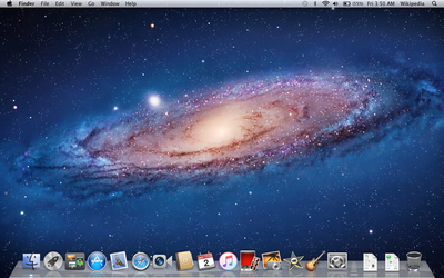
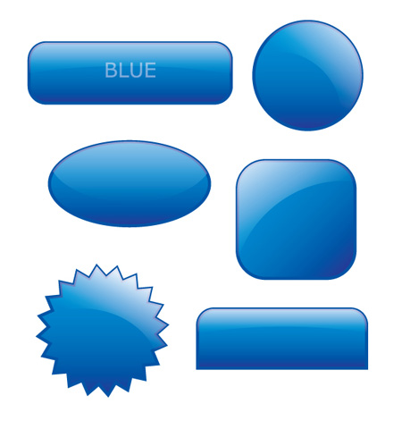
Apple continues the use of rounded corners in its latest build of OS X. Microsoft, too, used rounded corners till Windows 7, while Windows 8 ships new minimalist windows with the removal of Aero. The OS X also features glossy buttons which resemble glass.
Buttons and other elements of Web 2.0, which describes websites that use technology beyond static pages, were heavily inspired from the Mac.
And then iOS
With the release of the first iPhone in 2007, Apple decided to embrace skeuomorphism ever more. iOS (then iPhone OS) featured rich animations and textures which imitated real objects. Before the iPhone, nobody had ever seen such high quality effects (at least on a mobile device). And of course, iOS was full of rounded corners.
For example, the iOS Calendar app looks actually like one. The way days are aligned resembles a real calendar. The OS X Calendar (previously knowns as iCal), too, looks like an actual calendar, with those torn pages and leather textures.
It is safe to say that Apple has heavily inspired this design-style. Apple such as iBooks, Calendar, Notes, Reminders, etc., all feature skeuomorphist (oh, that’s not a word) design, and thus, have had a heavy impact on many other apps in the App Store.
The Argument against Realism
First of all, realism done wrong can morph into kitsch. After all, even in real life fake leather and fake wood are not exactly considered the pinacle of good taste, so why would things be any different on our screens?
Francisco highlights that in the use of smaller elements, like buttons or symbols, there needs to be a balance of detail and simplification. “If we go too far in either direction the meaning of the symbol becomes convoluted. With symbols and other UI elements we should be trying to communicate concepts, not replicate an exact physical object.”
Whether to differentiate themselves from Apple or because they actually thought this was a better concept, Microsoft did a pretty good job with their Metro UI. Gone were the rounded corners, gradients, shadows, blurring, and Aero. Instead, Metro offered flat rectangles and big beautiful typography.
Actually, the flat was of design has been here for a long time. You can trace its roots back to the Swiss style of design from the 1950s, but Microsoft managed to do a prominent job in changing the concept of minimalism.
I mean, of course, it’s pretty fun sketching leather textures in Photoshop, but it’s definitely not the best for a stock market app, is it?
Even in Game UIs, traditionally completely skeuomorphic, now are embracing minimalism. Letterpress is a shining example for flat design in games.
The Argument against Flat Design
This is not to say that flat design doesn’t have its own problems. The main victim is merely taste, taking minimalism too far can have serious consequences too. Users rely on, you know, clues to work their way through design. Buttons usually have a slight gradient with center-aligned text while text boxes have a slight gray border with radius.
Remove all these clues and you’ll end up with a place where every design elements is on the same level, which obviously leads to confusion. “Is this a button or just a heading?” “What happens if I tap this, will I see my on-screen keypad or will I navigate to another page?”
But does this mean to start hating minimalism as designer? Well, we can have
The Best of Both Worlds
It wasn’t a surprise that Google will enter with a design principle of their own. Google, unlike both Microsoft and Apple, wants to have the best of both worlds, skeuominimalism.
With the release of their new apps, Google introduced a design that is “almost flat,” but also features thoda-thoda skeuomorphism. The new style features extremely light shadows and gradients in a tasteful and subtle way.
But another way to look at it is that it’s simply design done right: seeking efficiency and simplicity without sacrificing usability to the altar of minimalism.
This, probably, is the way to go.